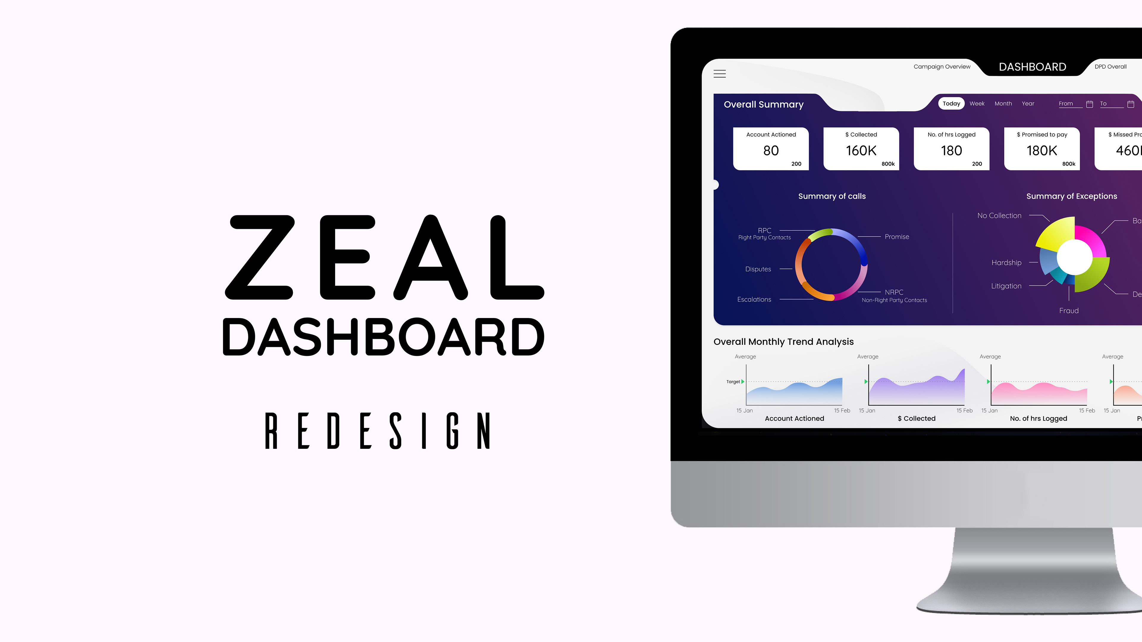
GOAL
Redesign the Zeal Solution Dashboard to make it mobile-friendly.
Redesign the Zeal Solution Dashboard to make it mobile-friendly.
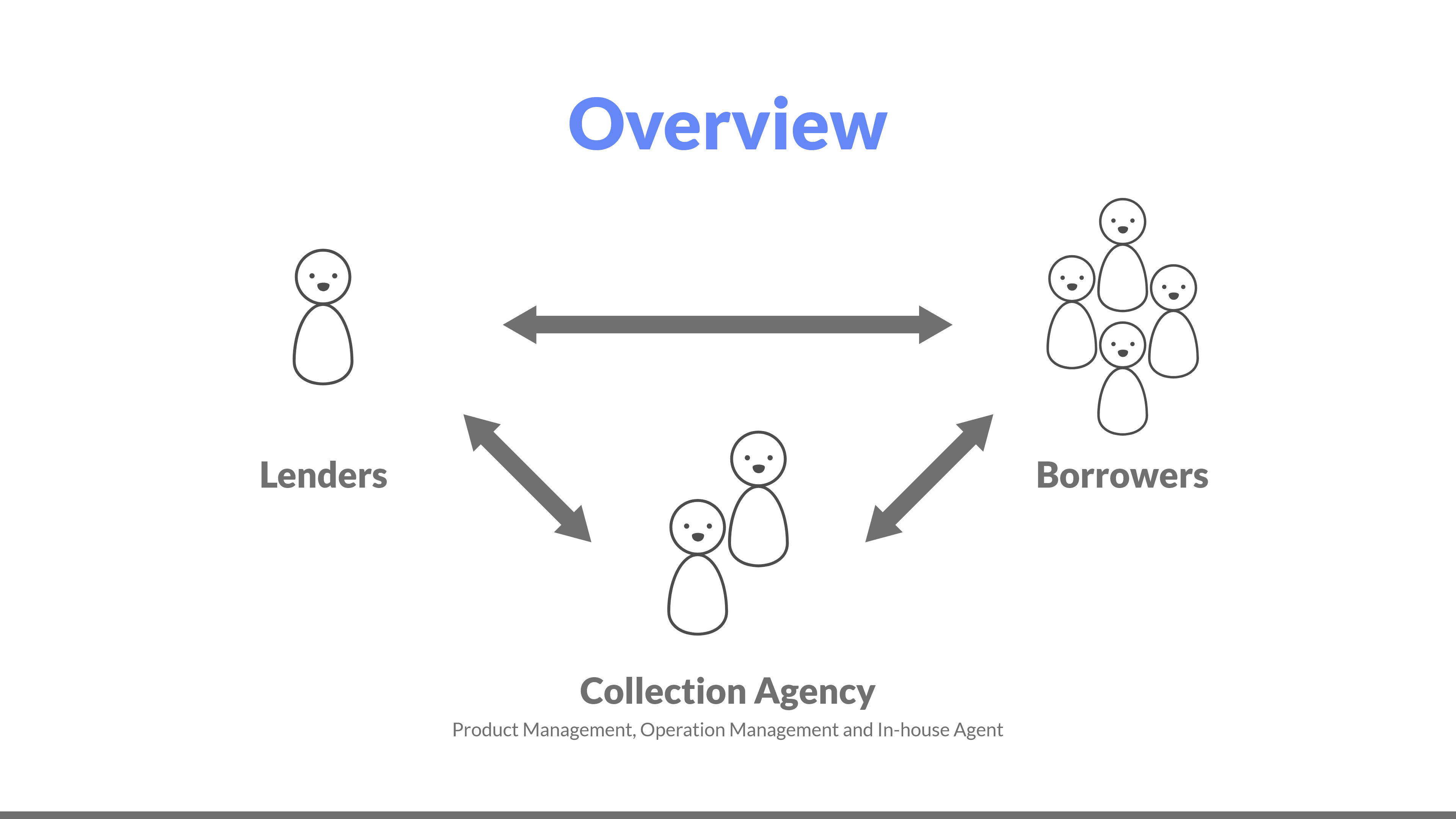
What is a Zeal Solution?
It is a digital tool to track and follow up with debtors, predict, and prioritize debt recovery. It also enables faster collections.
Usually, lenders rely on third-party collection agencies for repayments from clients. A collection software removes such dependencies. It can also send repayment reminders and offer payment terms to customers. It thus reduces the number of overdue invoices and increases the repayment percentage.
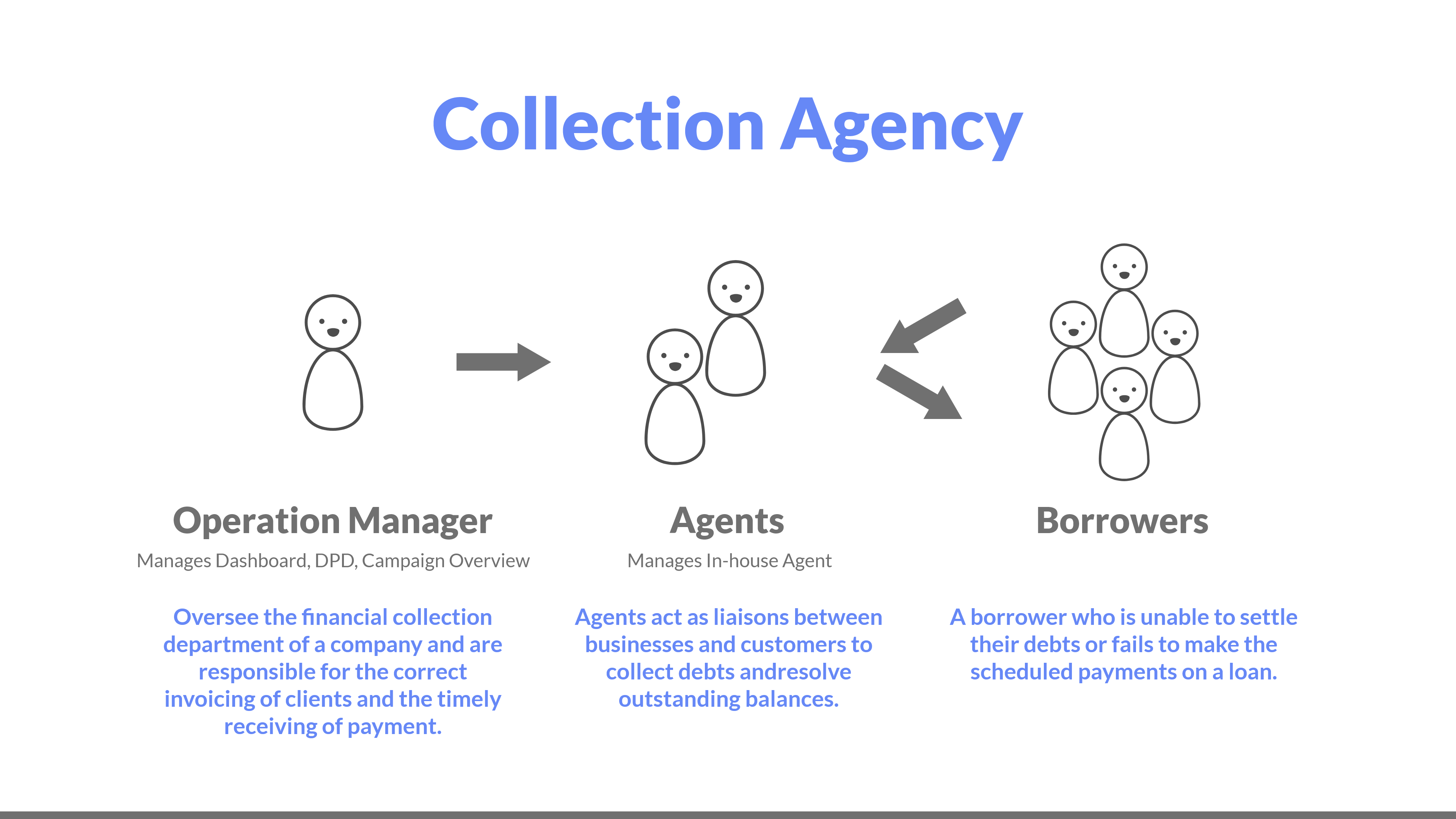
Who uses this Zeal dashboard?
This application is designed for operation managers to view the performance of agents, overall collection stats, and take necessary action.
What are my roles in Redesign?
My roles are User Research, User Analysis, Sketching, wireframing, prototype, and Visual Design.
Team Size: 3
Project Time Period: 3 Weeks
Tools used: Adobe XD and Useberry
Domain: Banking and Finance
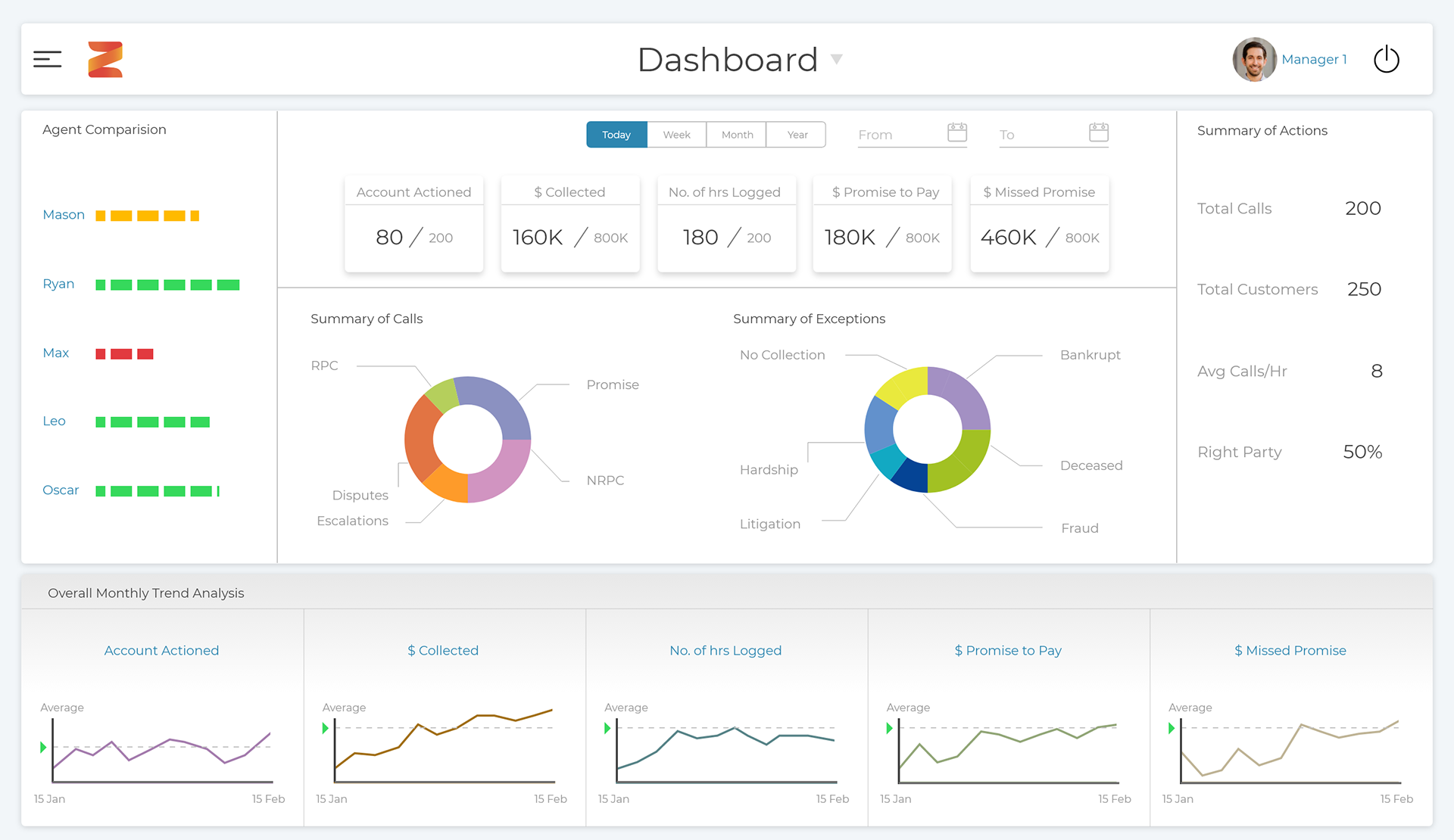
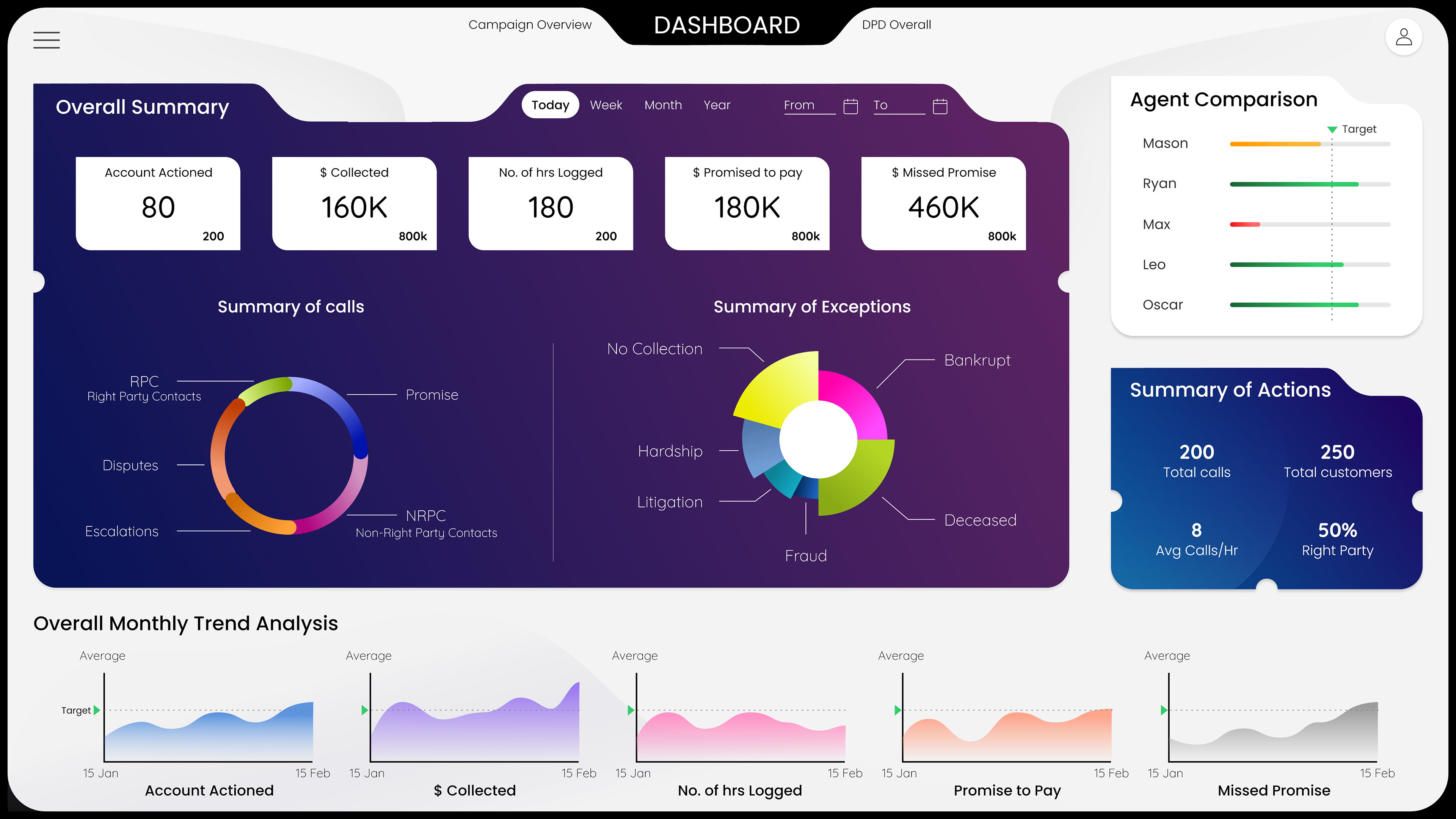
OLD DASHBOARD DESIGN
MY UX DESIGN PROCESS
1. Design Breakdown
2. User Research
a. User Survey
3. User Analysis
a. User Persona
b. Identifying key problem areas
4. Sketching
5. Lo-Fi and Hi-Fi Wireframe
6. Visual Design
7. Result
2. User Research
a. User Survey
3. User Analysis
a. User Persona
b. Identifying key problem areas
4. Sketching
5. Lo-Fi and Hi-Fi Wireframe
6. Visual Design
7. Result
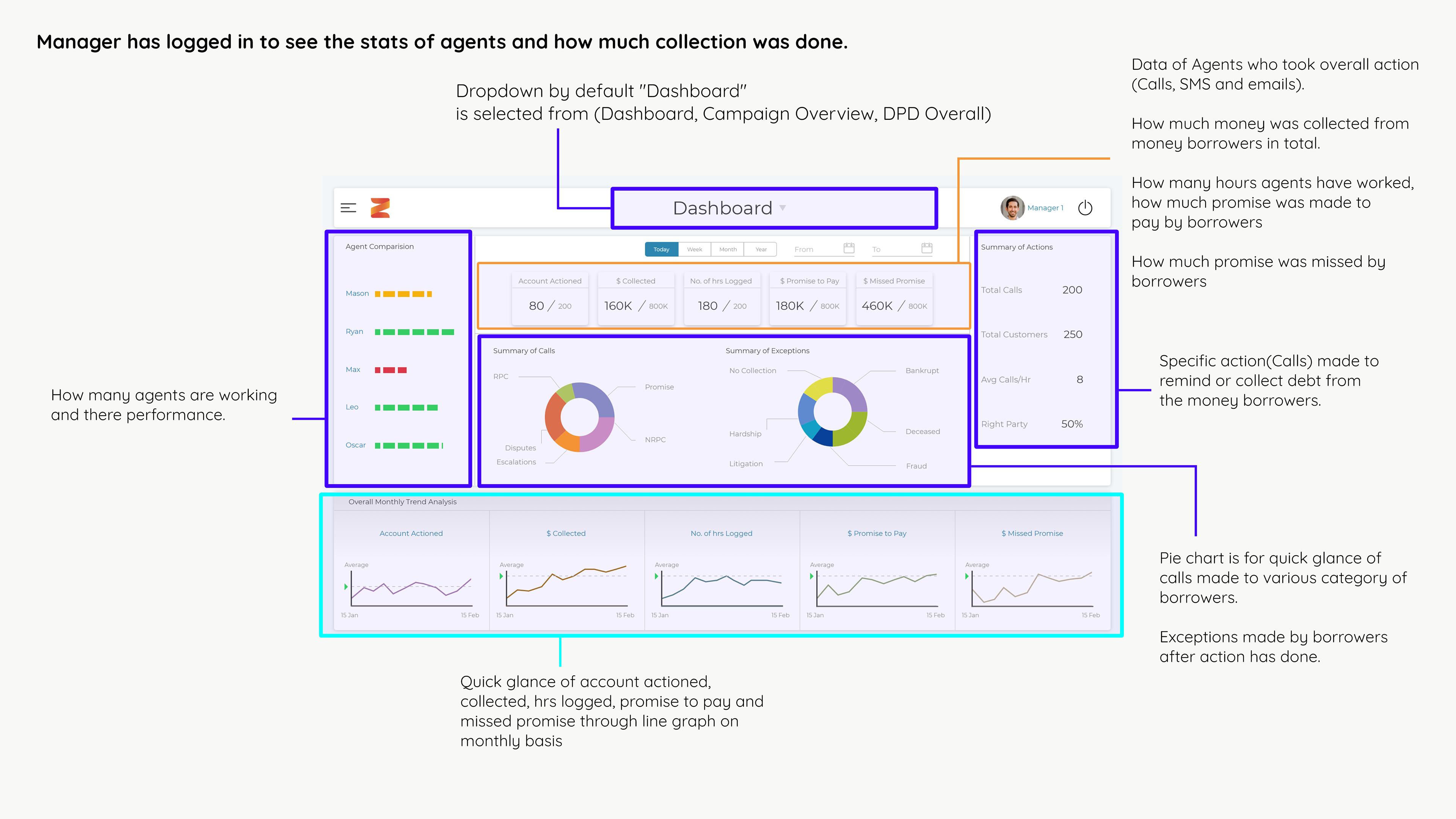
1. DESIGN BREAKDOWN
I decided to break down the old design for a better understanding of Zeal Dashboard.
2. USER RESEARCH
a. User Survey
We have done user research by sending a few questions to the backend users(Collection Agency) through the Useberry tool. I have also done some online research to understand the latest KPI features from other software.Why user survey?
We did user surveys rather than user interviews because we didn't want to disturb their work timing.
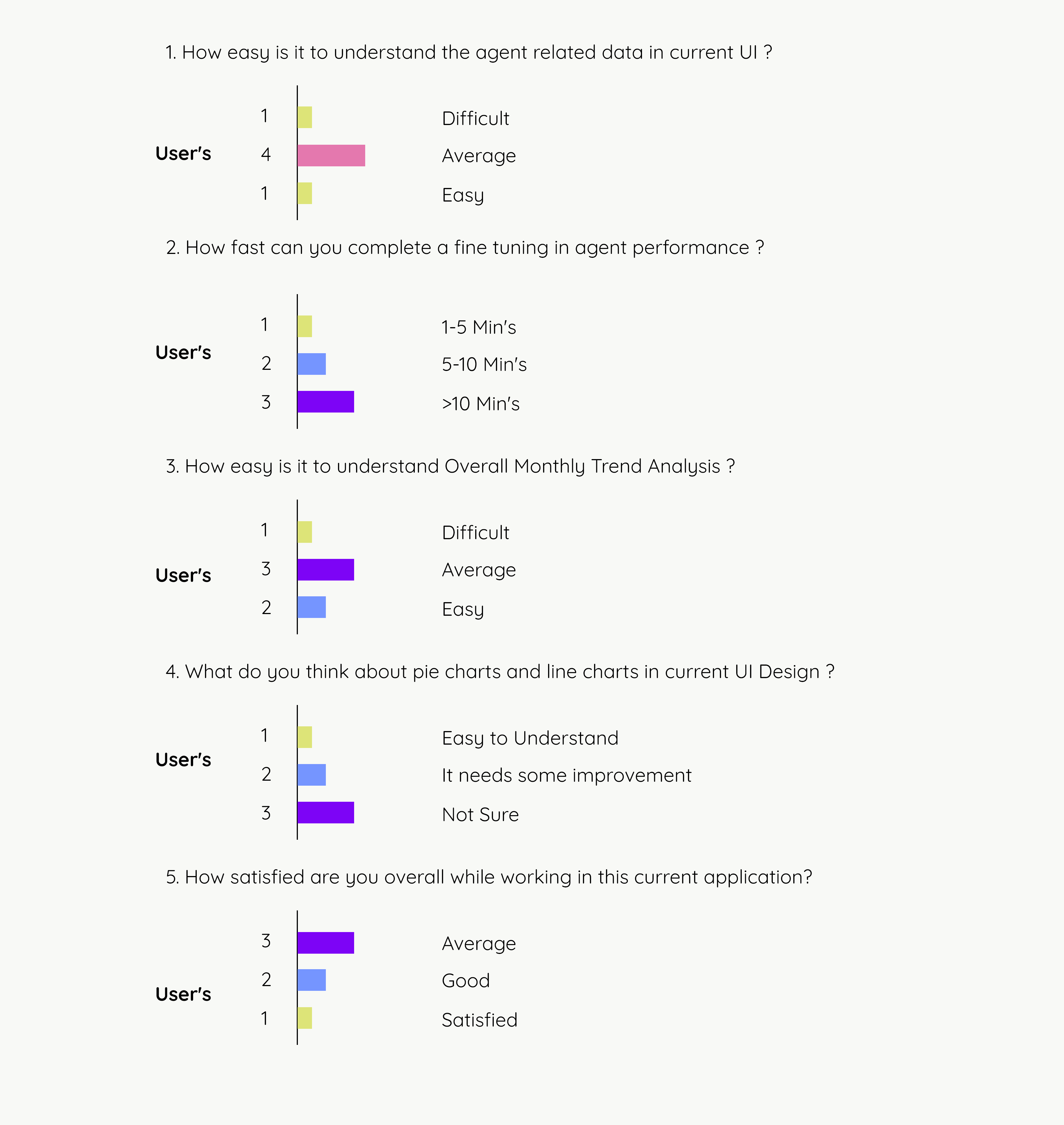
"Here overall user satisfaction score was 50%"
3. USER ANALYSIS
a. User Persona
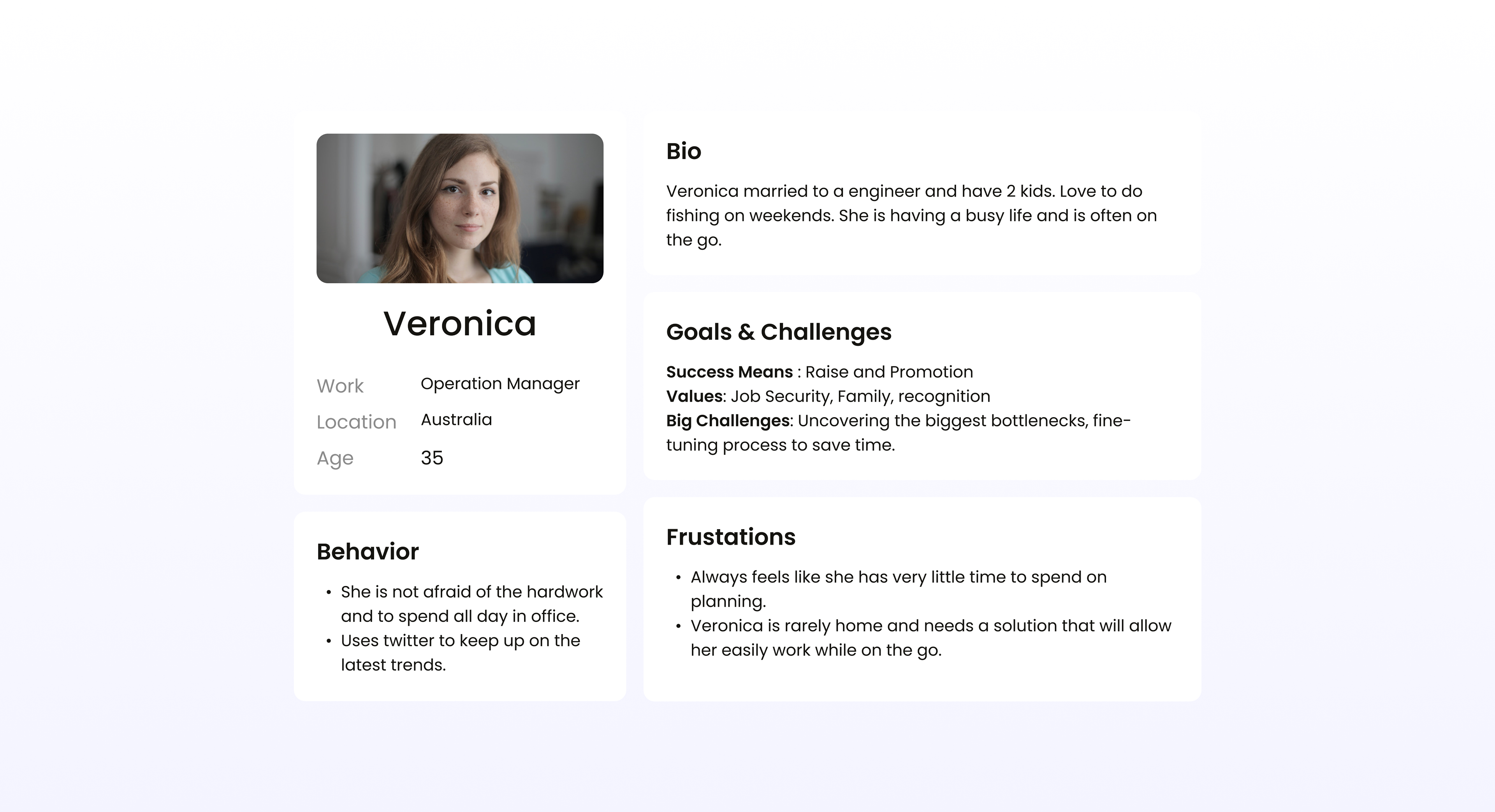
Doing user persona to understand more about the challenges and frustrations of an operation manager.
b. Identifying key problem areas
1. Application is not mobile-friendly.
2. Cannot differentiate the line chart in overall trend analysis.
3. Quick Comparison and immediate decision-making take's time.
4. Agent comparison needs a target.
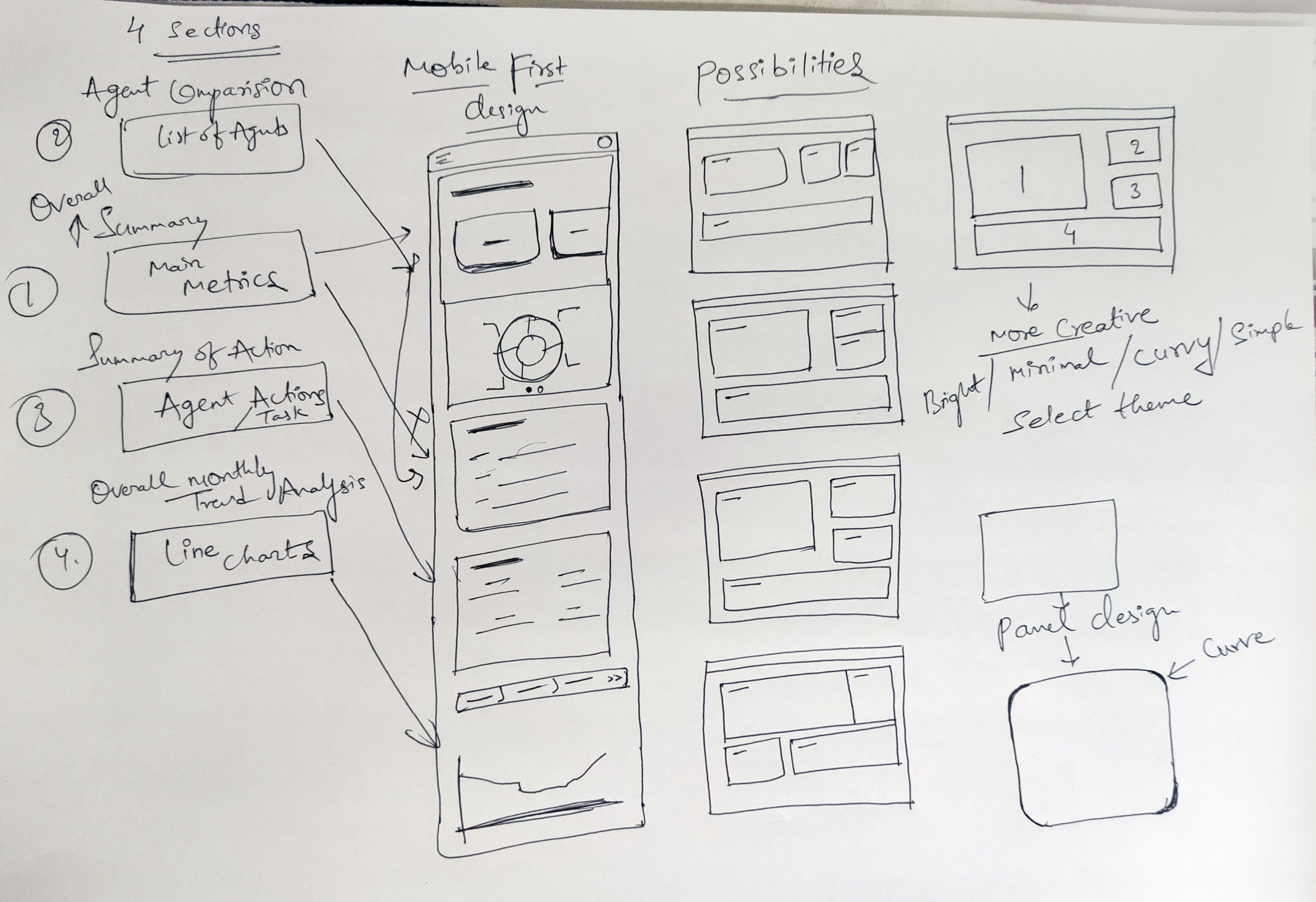
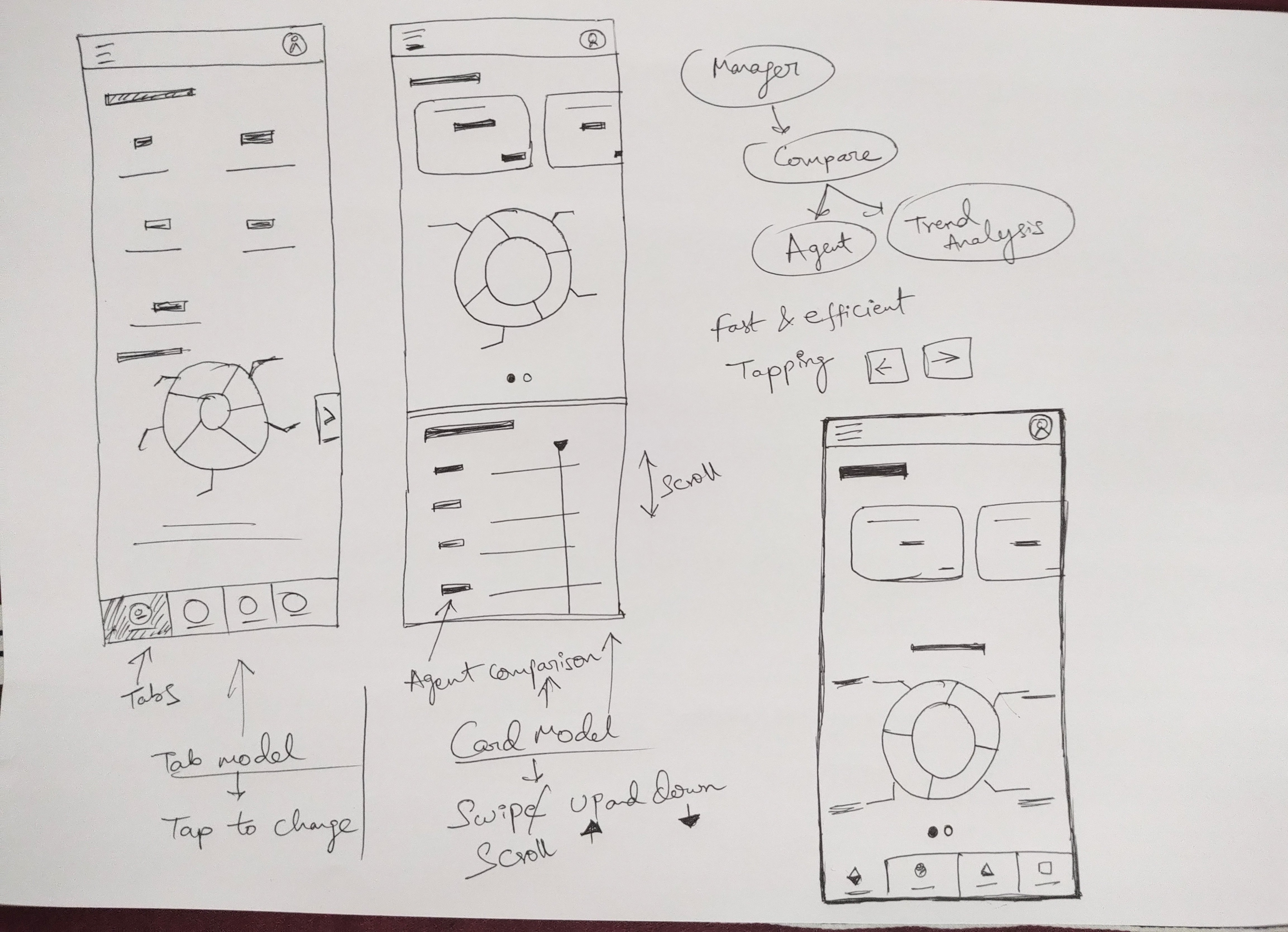
4. SKETCHING
I have drawn some quick sketches before starting the design. 3 to 4 iterations helped us to figure out the best result which everyone liked.
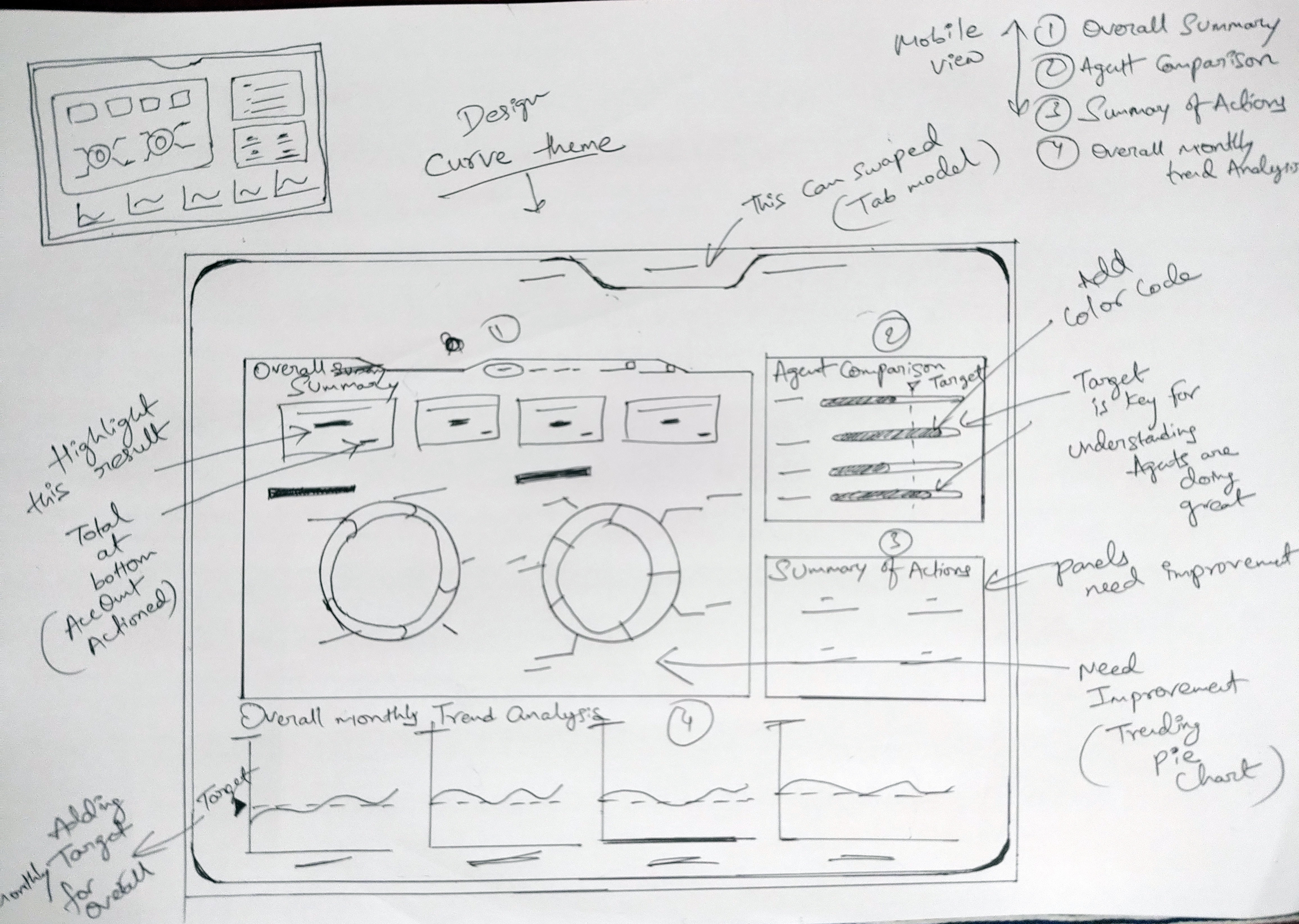
5. WIREFRAMES
a. Lo-Fi Wireframe
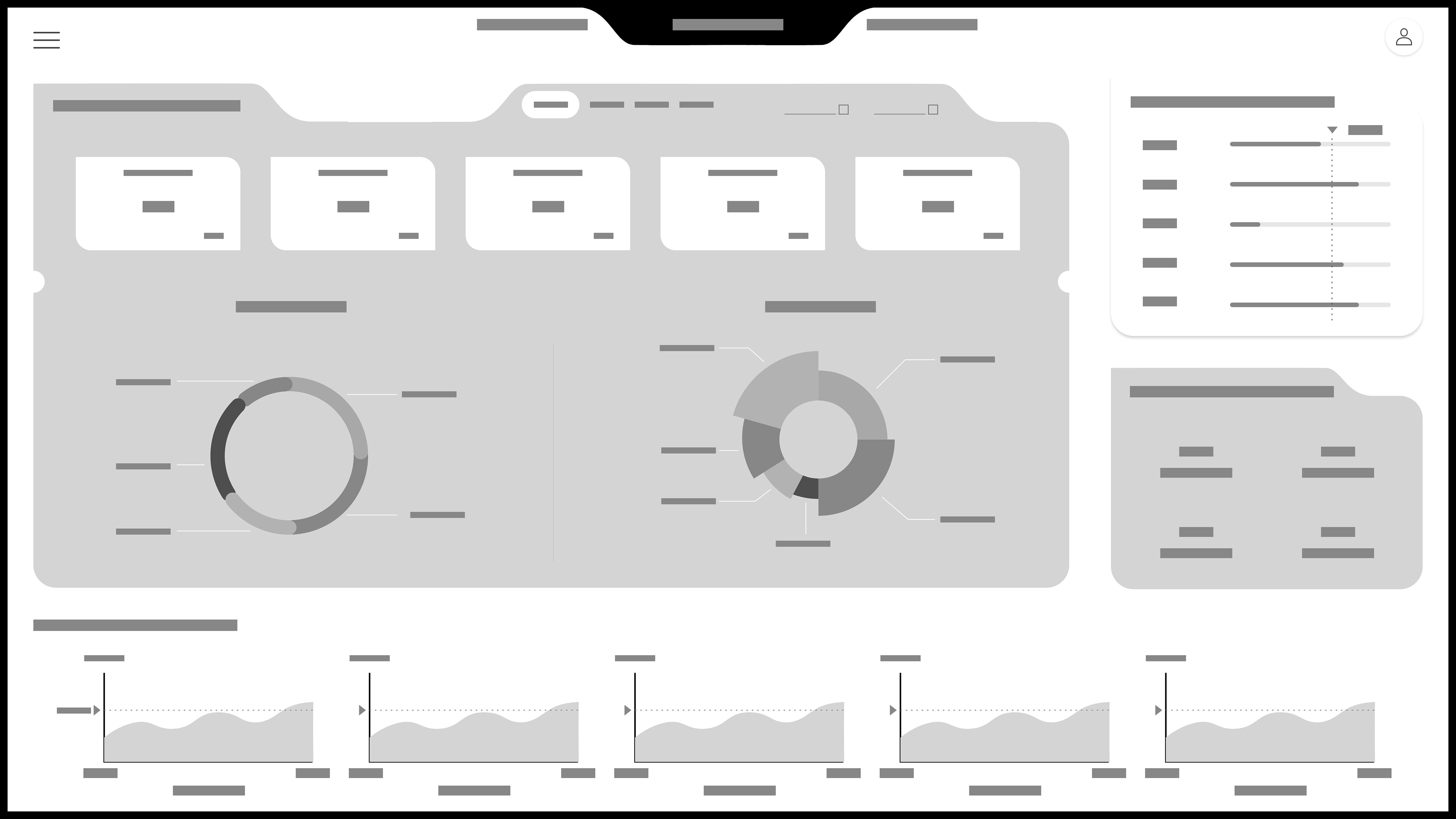
b. Hi-Fi Wireframe
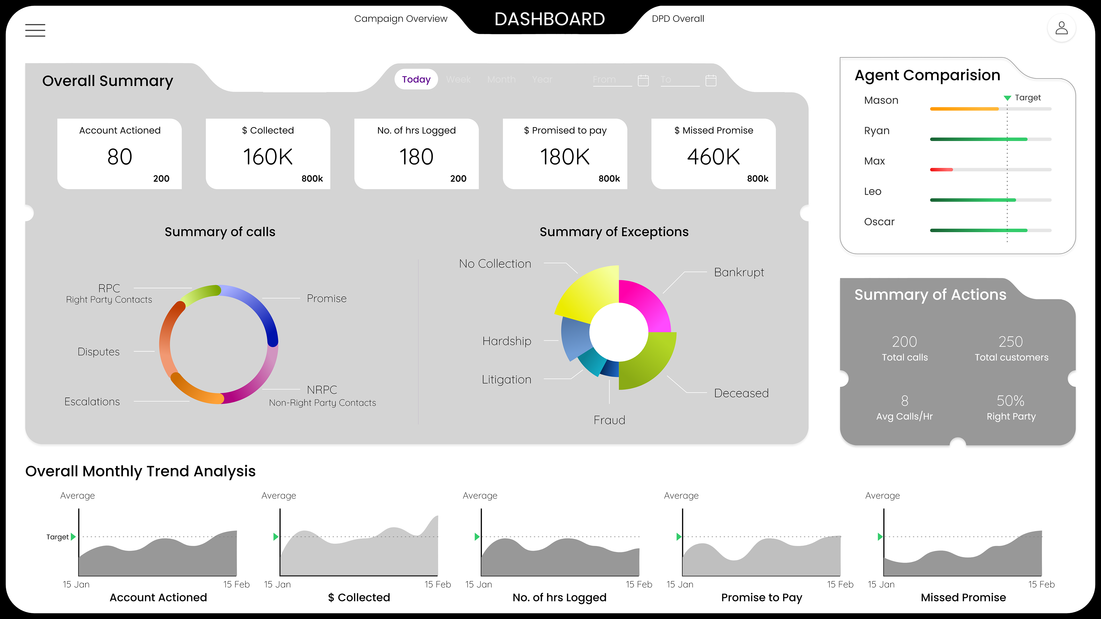
6. VISUAL DESIGN
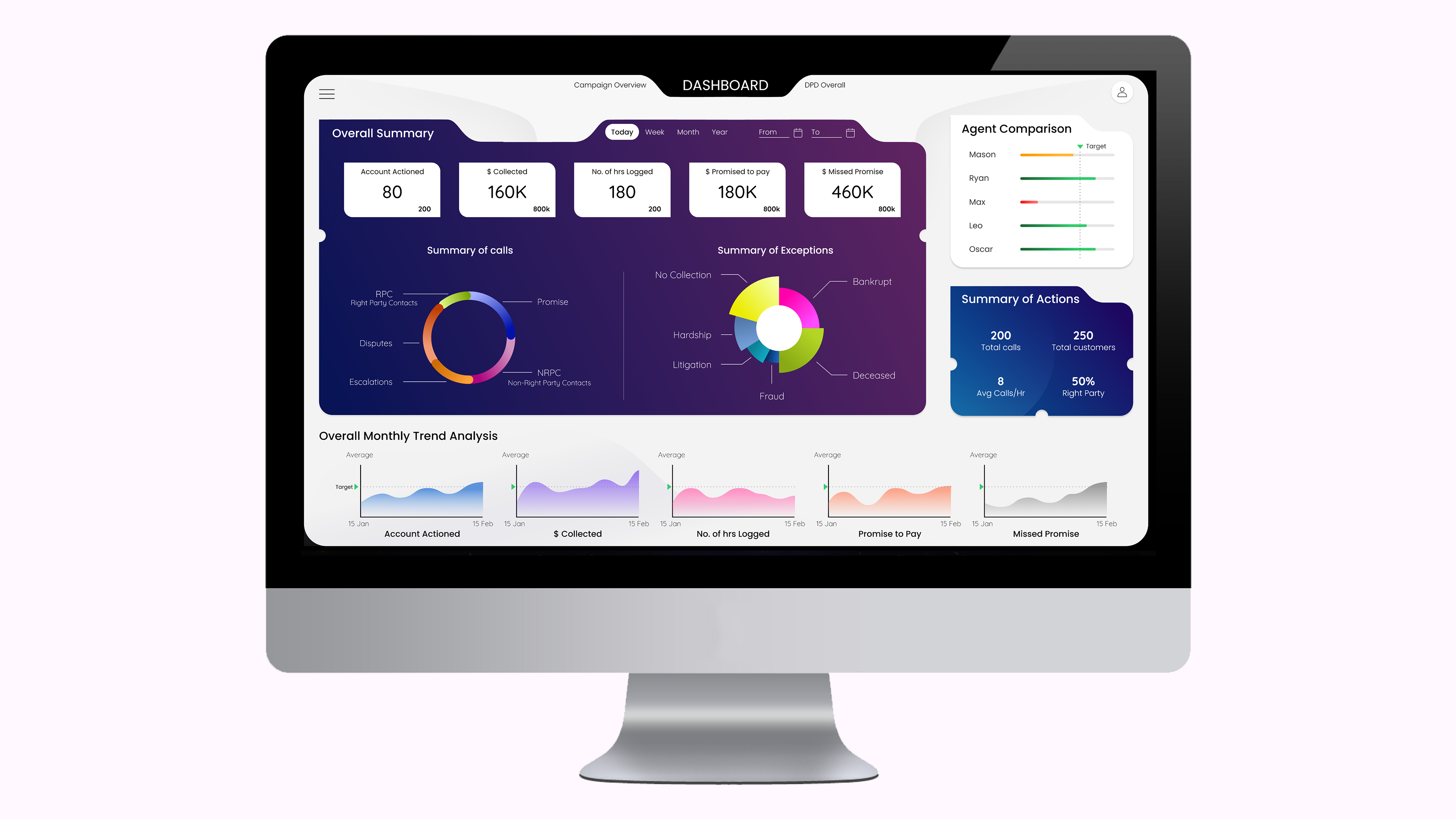
7. RESULT
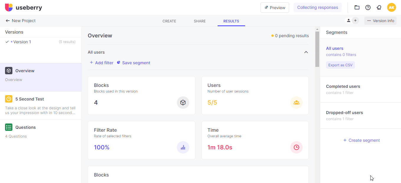
2 Usability tests were done.
a. 5 Second Test
b. Customer Satisfaction(CSAT)
b. Customer Satisfaction(CSAT)
Why did we do 5 Second Test?
To understand how quickly the user can recall in 5 Secs and how he feels what he saw.
To understand how quickly the user can recall in 5 Secs and how he feels what he saw.
The result is divided into "Got it" and "Didn't Got it"
We achieved 80% in "Got it".
Why did we use CSAT?
We want to know how far we reached their level of the overall experience.
We want to know how far we reached their level of the overall experience.
The result was 71.4% Customer Satisfaction. There was an increase of 21% from the previous result.
What do I learn from this UX Design Process?
1. Teamwork is very much essential to understand the problem much better.
2. Research gives us more insight into the problem in design and helps in getting the latest trends.
3. As always quick-to-fail methods are essential for designs. Like 5 Second Test and sketching on paper.